Here’s a controversial opinion:
The absolute best way to improve your ecommerce category page SEO is to improve the page’s user experience.
I’m not kidding. When it comes to product category pages (or “product listing pages” if you prefer), the UX is more important than keyword research, page headings, or any traditional SEO tactics.
It’s more important than backlinks, too.
Yes, all of those things can help you rank in organic search, but usability overshadows them all.
I’ll explain more below.
Why Good UX Is Crucial for Ecommerce Category Page SEO
All of the tactics we normally associate with SEO — keyword optimization, link building, etc. — can land your page at the top of the SERPs.
… But they won’t keep the page there.
In order to solidify your position at the top of Google for a particular keyword, you need to show Google that your page gives users what they’re looking for when they type that keyword into the search bar.
But if people keep bouncing from your page and going elsewhere, Google will likely assume that your page doesn’t offer what searchers want.
And what does someone want when they visit an ecommerce category page?
They want to look at products.
So, you have to make that easy for them.
If it’s too difficult, your rankings will likely suffer, and your competitors will start to outperform you.
Expanding Our Definition of “Search Intent”
Essentially, I’m saying that poor UX makes it difficult to satisfy the search intent of a query.
If someone wants to look at hiking boots and your website makes that hard for them, your site does not give searchers what they want. Therefore, it makes more sense for Google to promote other, better sites.
It’s really no different than if you were to write a blog article targeting the term “hiking checklist,” but your article just recommends a list of boots you like. It might rank for a day if it’s optimized for the right keywords, but it’s going to fall as soon as Google notices that no one actually engages with it.
Too often, we talk about search intent as it relates to blog articles or service pages but fail to consider how search intent affects product pages. That’s likely because their search intent feels obvious (a Google search for “hiking boots” probably comes from a person wanting to buy a pair).
But a page needs to function well in order for potential customers to browse. Anything that interrupts a searcher’s ability to look at products could drive them away — and leave Google assuming that your page doesn’t give visitors what they’re looking for.
How to Optimize Your Category Pages for Search Engines
All of that said, here are a few UX-minded SEO tips that will help your category pages rank at the top of the SERPs (and stay there):
- Prioritize visual elements over text.
- Incorporate breadcrumb navigation into your pages.
- Minimize pagination with infinite scrolling.
- Offer plenty of filters and sorting options.
- Ensure your featured image fits the page category.
- Use contextual product recommendations.
- Design your pages with mobile-friendliness in mind.
Let me explain why each of these tips is important.
1. Visual Elements Over Text
If someone is looking at a product listing page (PLP), they want to see pictures.
However, SEOs can be a bit eager to throw keywords on the page.
You’ll obviously need some text on the page to give the user — and Google — information about the product.
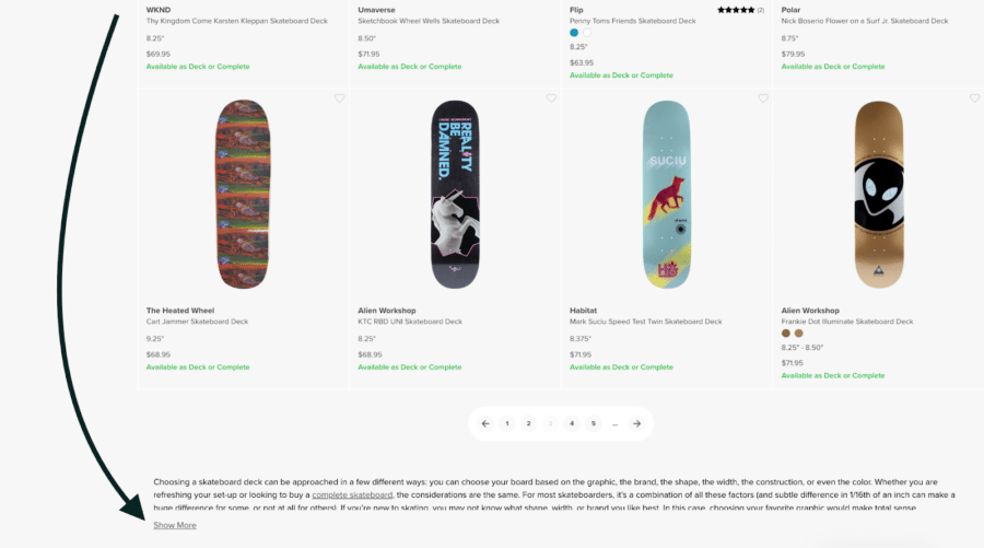
But category page content should be visual. Product descriptions should be as short as possible, and FAQs or other supplemental information should go in collapsible tabs at the bottom of the page, as seen here:

That way, shoppers won’t have to scroll past a bunch of text to do what they want to do, which is browse products.
2. Breadcrumb Navigation for Your PLP
Breadcrumbs are valuable for two reasons:
- They make it easy for users to navigate your online store.
- They act as internal links, which helps Google understand what type of products are on a particular page (e.g., an internal link that says “skateboards” tells Google that the linked page is your primary skateboard category page).
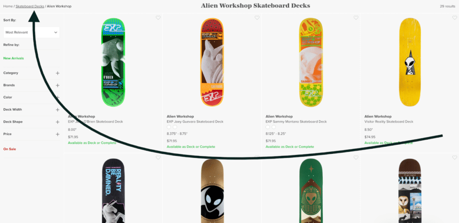
Here’s an example of what breadcrumbs can look like:

3. Infinite Scrolling to Minimize Pagination
Pagination is fine if you only have a few pages of products within a category.
When you have thousands of products per category, it can cause problems. Google only crawls a certain number of pages at one time, and its crawlers may fail to index important pages on your site because it’s too busy indexing paginated category pages.
That’s why it’s usually best for product category pages to have an infinite scroll feature. A “load more” button or allows you to keep shoppers engaged without adding more pages.
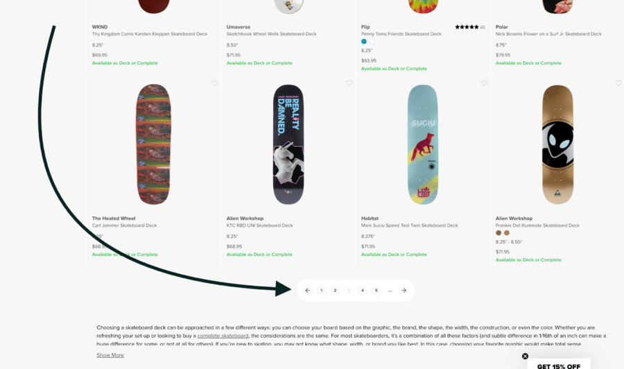
In the example below, we see a site that has “page numbers” to click through at the bottom of their category page, but those page numbers only expand the existing page.

4. Filters and Sorting Options
Faceted navigation features allow your visitors to narrow their search, increasing dwell time and improving the user experience by simplifying the buying process.
The best place for filters is the sidebar, where they’re clearly visible and intuitive to access.
Make sure your filters link to the correct URL. Some CMS filters auto-generate new pages based on the filter criteria.
For instance, if you built out a custom category page for black t-shirts, make sure that your “black t-shirt” filter leads people to that URL.
So if you built out a URL that looks like this:
yourwebsite.com/products/categories/t-shirts/black
Make sure to link to that, rather than an auto-generated page with a URL that looks something like this:
yourwebsite.com/products/categories?pf_v_category=tshirts&pf_t_color=Color%3A+black
I stress this point because a lot of businesses make the mistake of building out a custom category page but allow their Shopify filter to link to an auto-generated page instead.
An auto-generated page won’t have the same careful curation as a custom page, but it could end up outranking your custom page if it gets enough traffic.
5. Product Images That Match the Category
When someone arrives on your black t-shirt category page, they want to see black t-shirts.
Even if you offer the same t-shirt in multiple colors, you shouldn’t expect that users will click the product in order to find the color they’re looking for.
You may have to spend extra time building your category pages, but showing the user what they’re actually seeking can boost conversion rates and lower bounce rates, improving your SEO.
6. Contextual Product Recommendations

Most ecommerce CMS platforms allow you to generate user-driven product recommendations.
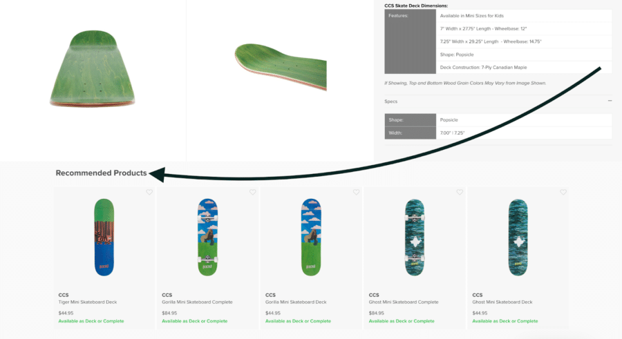
Adding a “Customers Also Bought” or “Relevant Products” widget to your page can improve click-through rates and strengthen internal linking without stuffing keywords.
There are a bunch of apps that make it easy to add this type of link, such as Code Black Belt’s Also Bought app.
7. Mobile-Friendly Product Category Pages
Mobile friendliness isn’t just good for user experience. It’s actually a direct ranking signal.
Not surprising, given that roughly 30% more people browse on mobile devices than desktops these days.
So, if you want your category pages to rank, you should make sure your page:
- Has a mobile-responsive layout (changes based on the user’s device)
- Loads quickly on mobile devices
- Contains no oversized images or Adobe Flash videos
- Uses a large and readable font
- Displays no popups
- Isn’t visually cluttered
A Few More Ecommerce Category SEO Tips
SEO can’t save a category page with poor functionality or user experience. When your page is user friendly enough to keep people browsing, you can start to think about keyword optimization and other SEO tactics.
If you have no experience with ecommerce SEO, here are a few steps you can take to get your category pages ranking in Google searches:
- Optimize title tags and meta descriptions: Including each page’s primary keyword within your metadata will help both search engines and human searchers understand what each page is about.
- Use short but descriptive URLs: Long URLs containing random numbers or symbols make it difficult for search engines to recognize the page’s main topic. Plus, they look kind of messy.
- Include keyword-rich headings and subheadings: Use H1 tags for the main category title and H2/H3 tags for subcategories or groups of products, including primary or long-tail keywords when appropriate.
- Link to primary category pages in your navigation bar: Linking to your most important category pages from a dropdown navigation menu shows Google that those pages are valuable to your site structure and that you want visitors to see them.
- Incorporate relevant keywords into your alt text: Alt text not only improves the user experience for visually impaired readers, but can be optimized for relevant search terms to help your pages rank in image searches (don’t keyword stuff, obviously).
- Build custom schema markup: Structured data snippets give Google a clearer understanding of your page’s purpose and site structure. Schema.org makes it easy to generate.
- Encourage your users to rate and review: This is more important than ever, as Google shows more featured product listings on the SERPs these days.
- Don’t forget about local SEO: If your business has physical locations, claiming your Google My Business profile and optimizing for local keywords can help drive organic traffic to your ecommerce store.
In addition to improving your site’s user experience, these steps are critical for search engine optimization.
Remember: Getting Visitors to Your Ecommerce Site Is the First Part of SEO
Keeping them there is equally as important.
Need some help improving your site’s user experience and growing your organic search traffic?
Let’s hop on a call and talk about how we can help you grow your ecommerce business!
SCALE YOUR ORGANIC TRAFFIC
Subscribe to our monthly newsletter


